Prioritising and sorting matched entries in Kee 3.5 and higher

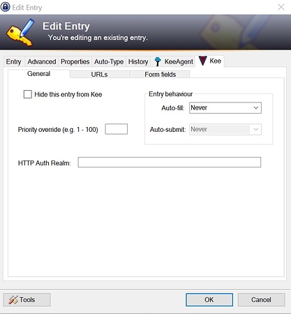
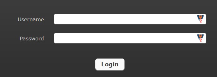
With the latest releases (Kee 3.5 and RPC 1.12.1) there seems to have come up the following change: There’s a website with different accounts/passwords. Within The Kee tab in Keepass of each of the (three) entries I set priorities 1, 2 and 3 to the respective entries. When at the login page and clicking the Kee icon now I get these entries presented in 3-2-1-order while before the updates I got (as designed) the intuitive 1-2-3-order.

When changing the numbers manually reverse around, this has no impact on the display. I stays the order (seems to be the order in the overview list of Keepass), no matter which priorities are given.

Is this known/planned? Will it be corrected?

Thanks
Philipp

I have the same issue, I don’t suppose it’s not a bug

This is an intentional change in Kee 3.5.

Allowing users to override the match scores for the set of matched entries has proven unreliable, confusing and consequently not heavily used. Therefore we have finally removed the feature from Kee after many years of warning against becoming dependent upon its existence.

To the best of our knowledge, the only use-case for this feature that can’t be replicated via other more suitable and reliable configuration options would be when someone wishes to manually configure a preffered display order for multiple accounts for one sign-in form on a website (I think this is your situation @phi?). Unfortunately, the cost to us and many other users for this feature being available is too high for it to remain a part of Kee.

In addition to those pre-existing alternatives, Kee 3.5 adds an improved search feature to the matched entries in the main popup so that easy filtering of many matching entries can more quickly narrow down the desired entry. For a future version of Kee, we will be considering how or if this approach can be applied to the list that is seen when one clicks on the Kee icon in a form field - it would be great to get your feedback on this idea once you’ve had a chance to try out these improvements in Kee 3.5.

I thought I had included information about this feature being removed in the release announcement but it looks like I forgot to do so. Sorry that it’s taken a while for me to write this information - you may have noticed that I’ve had to make some tough decisions regarding prioritising my time in the past week.

The KeePassRPC editing interface still exists in the latest version of KeePassRPC for two reasons:

  1. We want to allow the user the possibility of rolling back Kee to an earlier version if there is some mission-critical use-case for priority overrides that we have not previously been made aware of.
  2. We want the information to remain easily visible for a short while to help the users of this feature view their old configuration in case this helps with reconfiguring the entries to use an alternative approach.

It’s likely that we’ll remove the priority editing box as part of the upgrade work in GitHub issue 101

2 Likes

Congrat, you removed a feature which was working and many users relied on that. What if every programmer would keep removing features instead of solving problems? That’s the dumbest move I could imagine. Nice.

I completely understand that you need to make Kee/KeePassRPC as dumb as possible in order to push users towards your premium solution from which you expect some money.

Looking for forks, is there anyone did that?

2 Likes

“when someone wishes to manually configure a preffered display order for multiple accounts for one sign-in form on a website”
That’s my use case too

“Unfortunately, the cost to us and many other users for this feature being available is too high for it to remain a part of Kee.”
I don’t see what does it cost you to just keep it as it is

“it would be great to get your feedback on this idea once you’ve had a chance to try out these improvements in Kee 3.5.”
At least make the list near the login field sorted, not totally random if you don’t plan on keeping the feature. Definitely add search to the login field too, I use it much more than the main menu

2 Likes

Yes, that is exactly what it’s very useful for. I almost never use the icon-popup from the toolbar but only the one displayed in the edit fields of a login page. And that is where I like to have the most used credentials in my preferred order.

As said, I almost never use the main popup, any search functionality or filtering. The preselection is done by the domain/subdomain/query matching and whatever passes that filter is already narrowed down. Two mouse clicks, no more, no keyboard. Please keep it that way.

Philipp

2 Likes

In many cases, I have several ID/PW possible for the same web site.
This is why I used priorities, to have entries in my favourite order.
OK I may understand why the feature was discontinued.
However, now entries are listed in some strange order : I cannot find the rule, and it does not seem to be linked with Keepass database order.
Can you explain how entries for a single URL are sorted ?
Thank you !

1 Like

I regret having updated Kee today. Holy…

This was one of the most important features of the Kee Browser Extension. Now I have to select the correct entry on every single web page instead of just clicking login - two clicks plus scrolling and searching the list instead of ONE click. And it ALWAYS auto-fills the wrong entry now. I don’t believe that such a super-foolsafe-simple feature would cause any development/maintenance costs at all. Simply unbelievable - to me this looks like some mighty developer just doesn’t like this option/feature and decided to cut it out.

How can I get a specific entry to be auto-filled by default now? I usually have multiple accounts for almost all web pages out there. Not to count my self-hosted services with user and admin accounts. For many hosts I have even 30+ accounts (e.g. database users in pgadmin, phpmyadmin, service pages, mail server with mail accunts, family members, virtual machine users, etc.).

And which match scores are you talking about - There is no match at all in my case. I want to be able to specify any kind of scores by my self. Even the best match-prediction what so ever wont fit 100%. My own settings do. And now there is not even an option to sort the account list? Such basic features should be implemented in any kind of software even before the software has any purpose. How can something that just works be unreliable while intransparent predictions with ill logic in combination with a super-nice new search feature to work-around the admited mispredictions should be the solution?

It’s MUCH more likely that the corresponding documentation of the reliable and helpful prioritization feature was unreliable and not the feature itself!

I’m very sorry to say that and I really don’t want to be impolite - but this crippling move was just stupid and causes many users a lot of pain every day hundreds of times…

2 Likes

Same “problem” here… :frowning:

The problem is simple:
I have a url that have multiple logins and they were setup to be filled automatically with login 1 and ignore the rest. Ofc when needed I could select other logins from the list.
This behavior worked OK until latest updates of kee firefox extension and keepassrpc.

Notes:

Kee is latest version 3.5
KeepassRPC is latest version downloaded today 1.13
Kee already have this set:
Filling entries
Automatic
When Kee chooses a matching login for a standard form, Kee should: Fill in the form
Take this automatic action even when multiple matching entries are found: checked on

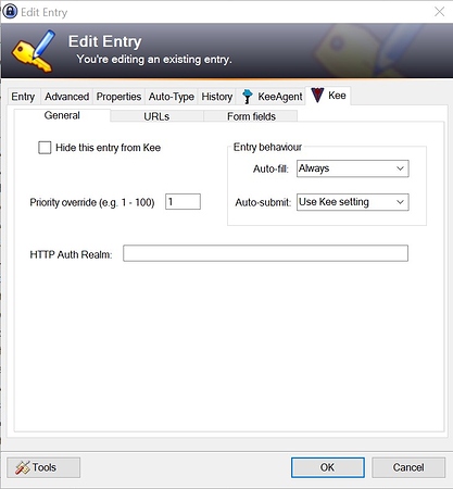
Login 1 looks like in the image bellow.

Login 2 looks like in the image bellow.

The final result looks like this:

The final result should have login 1 filled already.

Thanks in advance,
Best regards Ciprian

This might have worked previously due to a quirk in the old priority override feature that was removed in v3.5. If your first login was being sorted to the top of the list of matches then it could autofill but if now the 2nd login is coming at the top of the list, the Never auto-fill setting for that login will take effect.

If it looks like this is what is happening in your situation, you can return to the previous sort order by either ensuring the URL of the 1st entry matches the web page URL exactly (and the 2nd one does not) or by subtly reducing the score of the 2nd entry by removing some information from one of the form fields (such as the id).

First paragraph matches exactly my situation.

However the offered solutions are bad, both of them.

solution 1: ensuring the URL of the 1st entry matches the web page URL exactly (and the 2nd one does not) - is bad just because that will mean to change urls that i need to login (not even need to debate this is a bad solution)
solution 2: subtly reducing the score of the 2nd entry by removing some information from one of the form fields (such as the id ). - again bad by design that means will have to change dozens of id’s and tweak them until they work (doable but still bad)

Q:
What happen with old implementation of priority override feature, why is removed? Seem to me that was a very good thing and it is a part of Kee that we use.

Q:
Why just not implement again priority override feature?

1 Like

I expect this to be possible and will be prioritising it providing that the user feedback for the new main menu interface is positive enough.

@hellcry I’ve merged your topic into this one since it appears to be essentially about the same subject. @pasbec, I think your concerns are most closely aligned with the issues @hellcry raised.

Regarding changing the URLs as a solution. It’s common that websites have more than one way to access a login page, even if just by appending different query string or hash fragment information to them. It probably doesn’t work for a small percentage of websites but I don’t think it’s even close to being an unworkable solution.

For the 2nd potential solution, it’s impossible to say how many modifications would need to be made - it will depend upon how many entries you have and what their current configurations are like. In a lot of cases you might be able to simply add the correct ID to a single entry and have it all work from then onwards but you’ll know the setup of your entries better than I do - I’m only talking about the general case so I’m sorry if this doesn’t apply exactly to your situation.

I do appreciate that it will be a bit of effort to reconfigure things suitably in order to retain the “auto-fill of a single preferred entry” behaviour, and that in rare cases it may not be possible at all. Unfortunately, this use case for the old Priority override feature was not previously known to us.

Regarding the use-case of wanting to override the order of entries in the matched entries list, which appears to be the most common aim among those complaining about this change in v3.5, I’ll address a variety of the questions posed below.

The order you see now is the correct order in all situations - this is ordered by the quality of the match between the entry and the form on the web page. Previously, the Priority override could mess up the order because the override was associated with a specific entry and not with a specific web page / sign-in form.

The feature was introduced to Kee early on so that incorrect ordering could be manually overridden. Such instances of incorrect ordering now happen so rarely, if ever, that the feature no longer serves this purpose. I appreciate that for some people the override feature had the unintended side-effect of allowing you to define a preferred visual order for the entries and that some of you may have used it this way without being aware of the long-term support status for the feature.

I appreciate that for some people the consistency of this visual ordering was important and apologise for the stress involved due that ordering now being different and no longer controllable through the same method. I did think of the impact of this change many times over many years and can broadly summarise the conclusions again here:

  1. For users with a small number of matching entries, the order is not a hugely important factor because all entries are easily reachable in the list of matched entries - the only drawback here is a case of the one-off unexpected change in position.
  2. For users with a high number of matching entries, the order is already far less useful than an effective search feature because it takes so long to scan down the list to find a specific entry. Thus, with the release of the new matched entry filtering feature, the marginal benefits in this situation are also less important than with earlier versions of Kee. There is still the additional drawback of the one-off unexpected change in position of course, but this is unavoidable unless the feature was left exactly as it always was - something that was never going to be a realistic option.

Why is it not realistic? During user testing, no users found the priority override feature understandable. It does not behave in a predictable way in all circumstances and can be especially poor for those users who have multiple databases to maintain or have entries that provide access to more than one website. It overrides the correct accuracy score in a way that impacts which is the “top match” - while @hellcry has shown that this quirk can be used in a positive way once understood, most people do not achieve this level of understanding so the more likely outcome is unexpected form filling or submission of entries - something that can have far more serious consequences than the visual ordering of matched entries.

I appreciate that some of the problems with the old feature might not seem relevant or important to you, but they are facts and many users will benefit from the removal of the old feature so I’m not prepared to get into a discussion about the reasons or motivations for the change.

As for whether we can “implement it again” or “undo the change”. Essentially the answer to the latter is a definite “no” but for the subtly different former question, “maybe”. If we can design a suitable replacement feature that does not suffer from the complications of the old Priority override feature, I’d be happy to incorporate it, although I cannot commit to being able to dedicate much time to the feature myself so it may require a code contribution from someone else - we can decide this if we get to a point where there is a workable solution planned out.

Again, I am sorry that I did not have enough time in recent weeks to pull all this information into one place as part of the release notes for v3.5. In future, please note that these sorts of changes are generally released to the beta channel first - we don’t know how things would have worked out if any of you that are upset by this change had engaged in discussion about it before the release of v3.5 but obviously the more time that we have to talk about the issue, the more likely we could reach a viable solution before a change gets released to all users.

You have probably now understood that I consider the original implementation of the priority feature a mistake. I understand that if you have found a way to use that mistake to your advantage, you will be upset that I have now removed it. I am not against the idea of allowing matched entries to be reordered through some mechanism but the previous priority override feature was not the correct way to go about implementing that feature.

I am happy to work with anyone who wishes to engage in a positive way on new features to support your preferred way of working with Kee.

1 Like

Thank you @luckyrat for your extensive explanation. I really appreciate this!

I think this is the most annoying drawback of the missing prioritization override functionality. I really loved the Kee Browser Extension for its ease but the broken auto-fill now prevents all users with mutliple acocunts to simply click the “login” button using default credentials. The one-click solution is gone.

I still don’t understand the meaning of “correct in all situations” here. From the users view Kee does not behave as intended since the list seems to be sorted arbitrarily - so it really does not feel “correct”. How is the “quality of the match” e.g. different for a bunch of account entries which only differ in title, user name and password values while everthing else is exactly the same (URL, form fields, etc)?

I am sadly one of the condidates with lots of URLs where I have a high number of matching entries. Using the prioritization override I could easily prioritize important matches (e.g. default account, admin, postmaster, test user) at the top of the list. This option is now gone. And with the search only availabe via the main menu (on the other side of the screen, usually hidden by default to keep the browser interface clean) it is a pain to access these important entries now.

I’m still looking for an easy way to get the working default auto-fill back WITHOUT CHANGING OTHER ENTRIES than the default one. Otherwise I had to update 95% of my database. Everything I tried to change in the default entry just reduced the “match score” of it but I wasn’t able to increase the “match score” if there are several perfectly fitting entries in the database.

Wouldn’t it be possible to implement a simple “prioritization flag/checkbox” that increases the match score only within the set of matched entries to push selected entries to the top of the login menu?

Or you could allow the user to change the order via the extension settings that then could be synced across devices. But I guess this would be more complicated.

Apart from that I guess adding the search feature to the login field menu - like proposed by @Hackerpcs would make life much easier.

Thanks again. Without your info the removal really feels like an arbitrary change. I’m curiously looking forward to see feedback from other users and how this evolves…

1 Like

@luckyrat First of all, thanks for Your work. Keep it going :slight_smile:
Priority override was really useful feature and i hope You gonna find some suitable replacement.

1 Like

The order you see now is the correct order in all situations - this is ordered by the quality of the match between the entry and the form on the web page.

There is no quality of match for identical entries besides user/pass, it’s totally random and that’s the problem, it’s not even sorted by username which could make sense.

It’s a total mistake to have the list random, non-sorted and non-searchable from the login form and remove the priority feature, it leaves us with a broken random list that isn’t usable. You have to first implement a viable alternative to the priority feature and then remove it, now the login drop down menu is broken with no alternative.

1 Like

To be honest that order can be alphabetical for all i care, my problem is i can not select what username i want to fill in that login form. I want to be able to have 10 logins on a site all the same only user and pass difference and be able to select witch one is gonna be filled and witch not. That’s all.

1 Like

I just found out by trial and error that if there are multiple entries which are absolutely identitical in terms of URL, form fields, etc. except for uid/title/user/pass (e.g. by duplicating it in KeePass), the list is ordered alphabetically by title (not user name which is shown first in the login menu from Kee). This might be the reason why the sorting seemed arbitrary for me.

Anyway, it means that one entry could be prioritized over others simply by appending spaces to its title. The more spaces you add, the higher the priority. But as I said, this requires all matching entries to be absolutely identical except for uid/title/user/pass. I have had to remove some orphaned form fields on several pre-existing entries that I tested. It’s a nasty hack but it seems to work for me.

Maybe @hellcry, you could try if this (temporarily) “fixes” your auto-fill issue?

I’m however a bit worried that this “quirk” will be “fixed” with one of the next releases of Kee (e.g. by switching to the user name as secondary level of sorting).

Until then we could get happily involved in Space Wars!

1 Like

Thanks for confirming that @pasbec. I thought that the ordering would be alphabetical when all else is equal but couldn’t see evidence in the code that this is the case so I didn’t mention it earlier.

Having looked more closely, the list of matching entries being sent from KeePassRPC to Kee is ordered by title. Because we then re-order by match quality in Kee, we can’t say for certain that this alphabetical ordering will remain but it does appear as though this is the way it currently works out.

If prepending a space to a preferred entry allows a reasonable workaround for selecting one preferred entry, I can make a concerted effort to ensure this ordering remains the same in future Kee updates.

The user name is shown first in the matched logins list since that is more likely to provide additional information to help people to differentiate between different accounts (titles are often the same for each entry). We don’t have any plans to secondary sort by username and if we ever added that feature, it would be an optional behaviour.

How is the “quality of the match” e.g. different for a bunch of account entries which only differ in title, user name and password values while everything else is exactly the same (URL, form fields, etc)?

It might not be, as is probably the case for most people interested in this topic. For some additional context, consider the situation where a website has multiple different sign-in pages (e.g. https://admin.example.com/ and https://user.example.com/) - in this situation, the match quality will vary between those two URLs on the same website and thus the ordering via match quality ensures that the correct entry is listed first (and auto-filled if that’s how you configured it to work). By ordering matches by title or username before match quality, this very common use case for Kee would not be able to work correctly.

Wouldn’t it be possible to implement a simple “prioritization flag/checkbox” that increases the match score only within the set of matched entries to push selected entries to the top of the login menu?

A checkbox might be simpler for people to understand and solve the problem in some cases but it probably wouldn’t be general enough to help out those who really desire complete control over the ordering of every matched entry within a list. Maybe we’ll offer both approaches eventually but it’s too soon to predict which would be made available first.

Or you could allow the user to change the order via the extension settings that then could be synced across devices. But I guess this would be more complicated.

My initial thoughts around this are that an ordering solution would need to be focussed upon Kee settings within the browser, rather than on an entry within KeePass (like the old Priority override number). I’ve not had time to explore this so can’t be sure exactly what form it would take or whether it’s even possible but one issue to bear in mind is that syncing across devices would only be possible via a Kee Vault account (because it costs money to run the servers to allow this - the free service offered by Mozilla/Google is too limited for Kee’s requirements already, even without adding this additional data).

I just wanted to add my voice to the ones of those who are disappointed and show my support to @pasbec’s remarks and answers (except for the ‘appending spaces’ solution which is not a practical workaround when you deal with a lot of entries for the same websites).

I’m not sure what exactly was the problem with the - very useful in my opinion - priority override but I am convinced this feature will be missed by quite a few people like myself.

Obviously I am also sad to read that, if it is somehow coming back, it will only be in the Vault / hosted version of Kee and not integrated in the KeePass database as I prefer to keep full control on that kind of data and make it as private as possible.

But, hey, I understand your point of view and thank you for your detailed answers. At least I know I should try to see if there is a viable alternative to your really great piece of software somewhere out there.

Keep up the good work and I sincerely hope Kee Vault will become everything you want it to be.