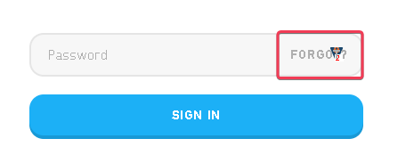
I found multiple site having problem to click profile selection button, as overlapped with other options:
4 Likes
I support this by both hands!
I also request this. I am finding more than a handful of sites adding text or their own custom icons that overlay/interfere with the lock. And I imagine there will be more and more uses of modern styled CSS input boxes.
Moving it somewhere else is just going to cause conflicts with other parts of web pages (in this case left aligned would overlap the Password placeholder and any typed text). Therefore this would have to somehow be configured on a per-field basis. We don’t have any way to apply such configuration at the moment and I’m not sure it would be possible to reliably support it either.
I appreciate this is an increasingly common issue and have my eye on a couple of potential improvements to web browsers (hopefully arriving this year) that would open up alternative approaches to how we can enable your interaction with Kee. Therefore we might end up entirely removing the icon from the field, or at least making it an optional feature.
Other options include a per-site setting for some alternative icon locations - it won’t be as complete a solution as a per-field option but would be able to use the existing configuration code rather than writing a whole complex feature just to solve this problem. Still, it would be a huge amount of work for everyone to configure their own exceptions to the default behaviour so I would prefer to focus on anything that can entirely remove the need for such configuration in the first place.
As with all potential work on Kee, I will first need to spend a huge amount of time converting the add-on to work with Manifest v3 to ensure it has a future. I’m optimistic but can’t justify spending time on anything other than critical fixes until I’m 100% sure that effort can still be appreciated in 2024 and beyond.
In the mean time, don’t forget that the main Kee button also contains matched entries (and you can trigger it via a keyboard shortcut) so when the conflict only stops you clicking the Kee icon in the form field, this can be a decent workaround.
1 Like
As a workaround, can we just add a margin-right 24px ? (it will fix most of hide/unhide case)